REGENERATION (WIP)
Role
Director
Design
Animation
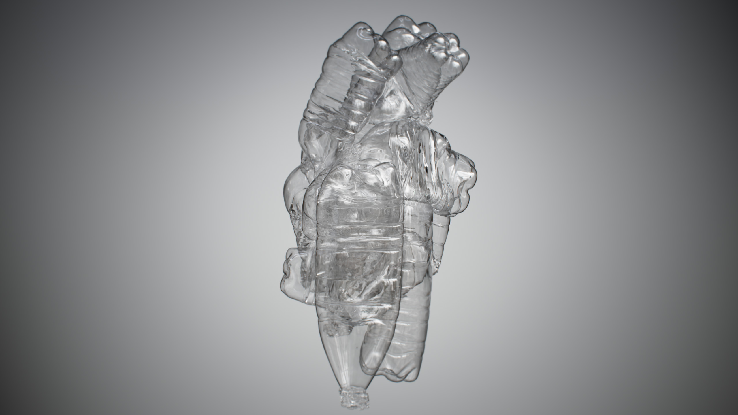
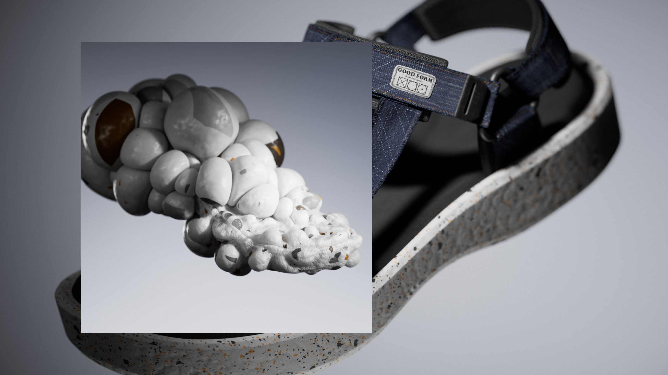
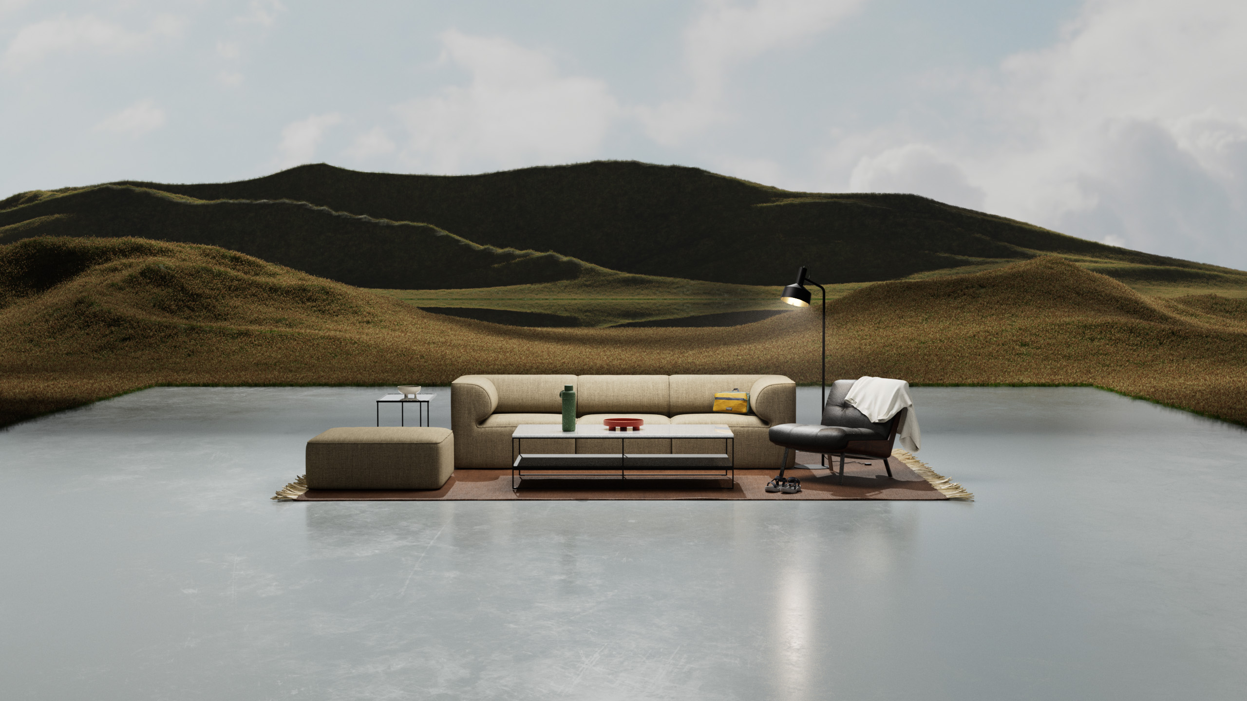
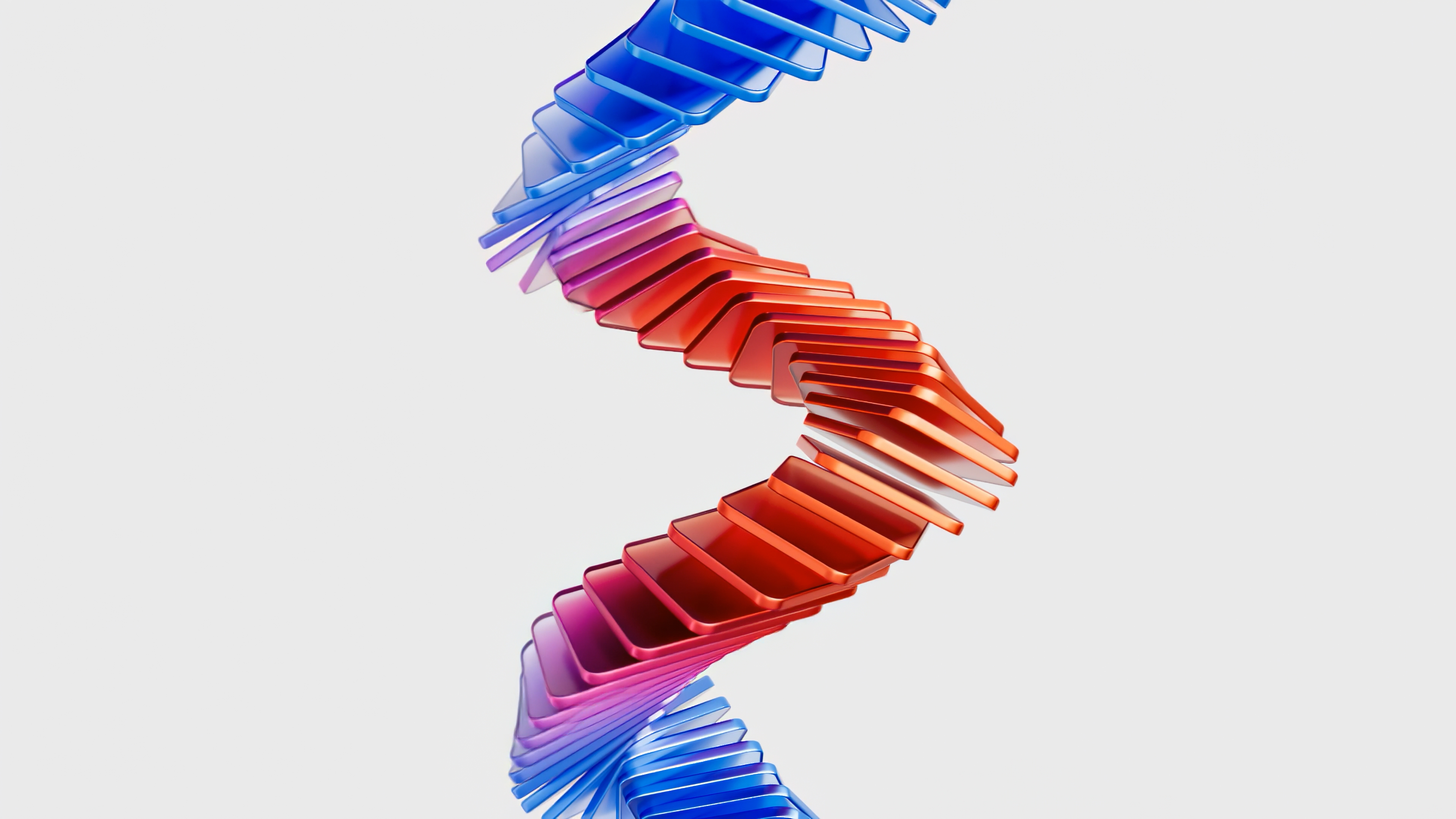
In light of our concerns for the future of the Mother Earth, Good Form aimed to craft a short animation that brings attention to the negative impacts of plastics. The goal was not only to highlight the adverse effects but also to showcase how modern technology can play a crucial role in mitigating it through recycling.
** This is an on-going project. Typography and music are placeholders.
DESIGN DEVELOPMENT
As the sole designer on this expansive project, taking it on was no small feat. To manage the enormity of the task, I strategically divided it into smaller, manageable chunks. My process is as follows:
- Crafting story arcs
- Developing storyboards
- Engaging in Research and Development (RND)
- Crafting styleframes
- Animating
- Compositing
This systematic approach allowed for a more organized and effective workflow, ensuring a successful execution of the project.
** You can explore my workflow futher here.
For this specific project, I divided the story into three main parts:
- The long-lasting and negative impacts of plastics
- How technology can be leveraged to reuse plastic
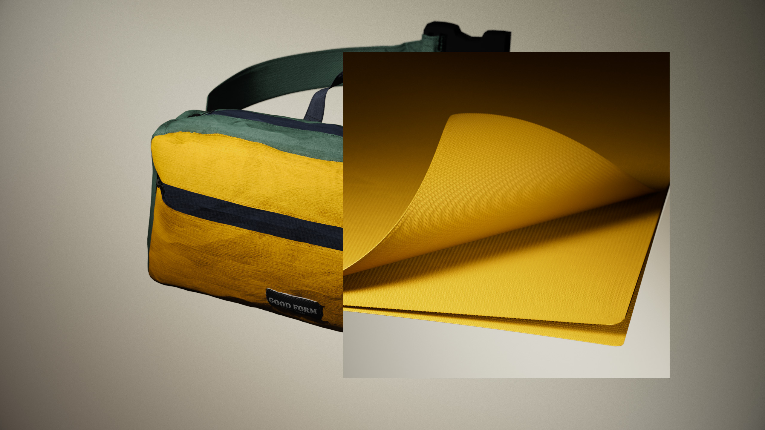
- Integration of recycled objects into people's lives
Having defined the core story arcs, my next step involved crafting the storyboard, supplemented with supporting references to enhance clarity and visual precision.
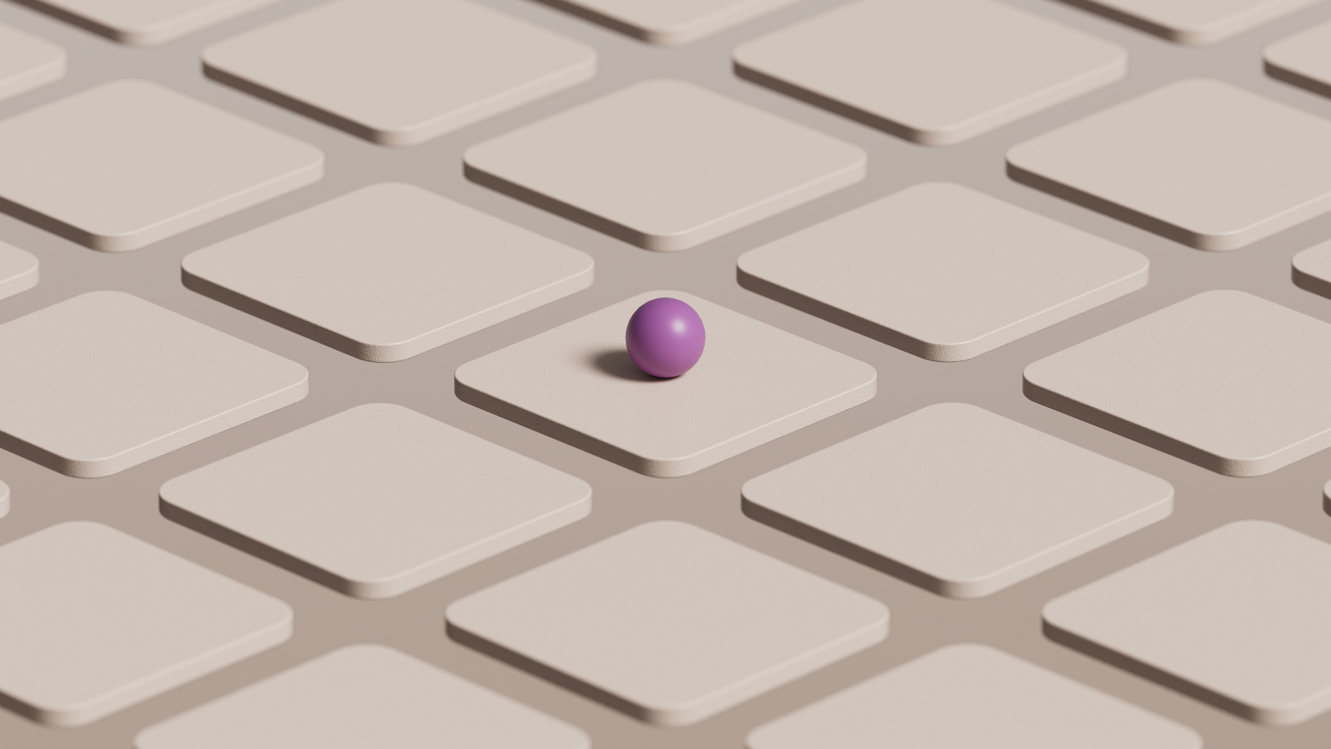
Typically, this is when the overall look of the project is defined. However, recognizing the simulation-heavy nature of this animation, I opted to focus on RND at this stage.
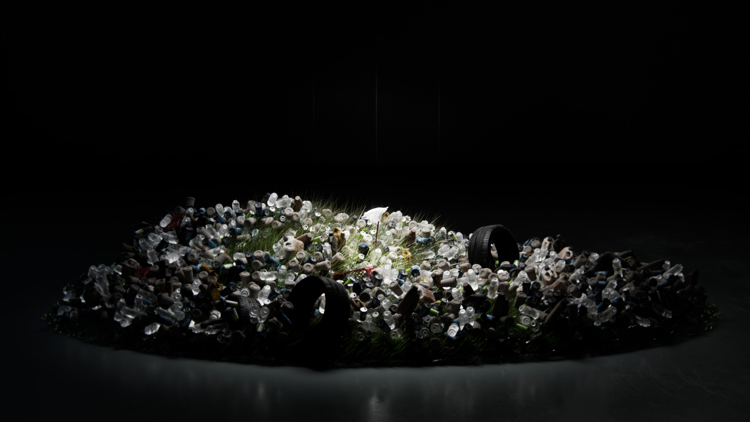
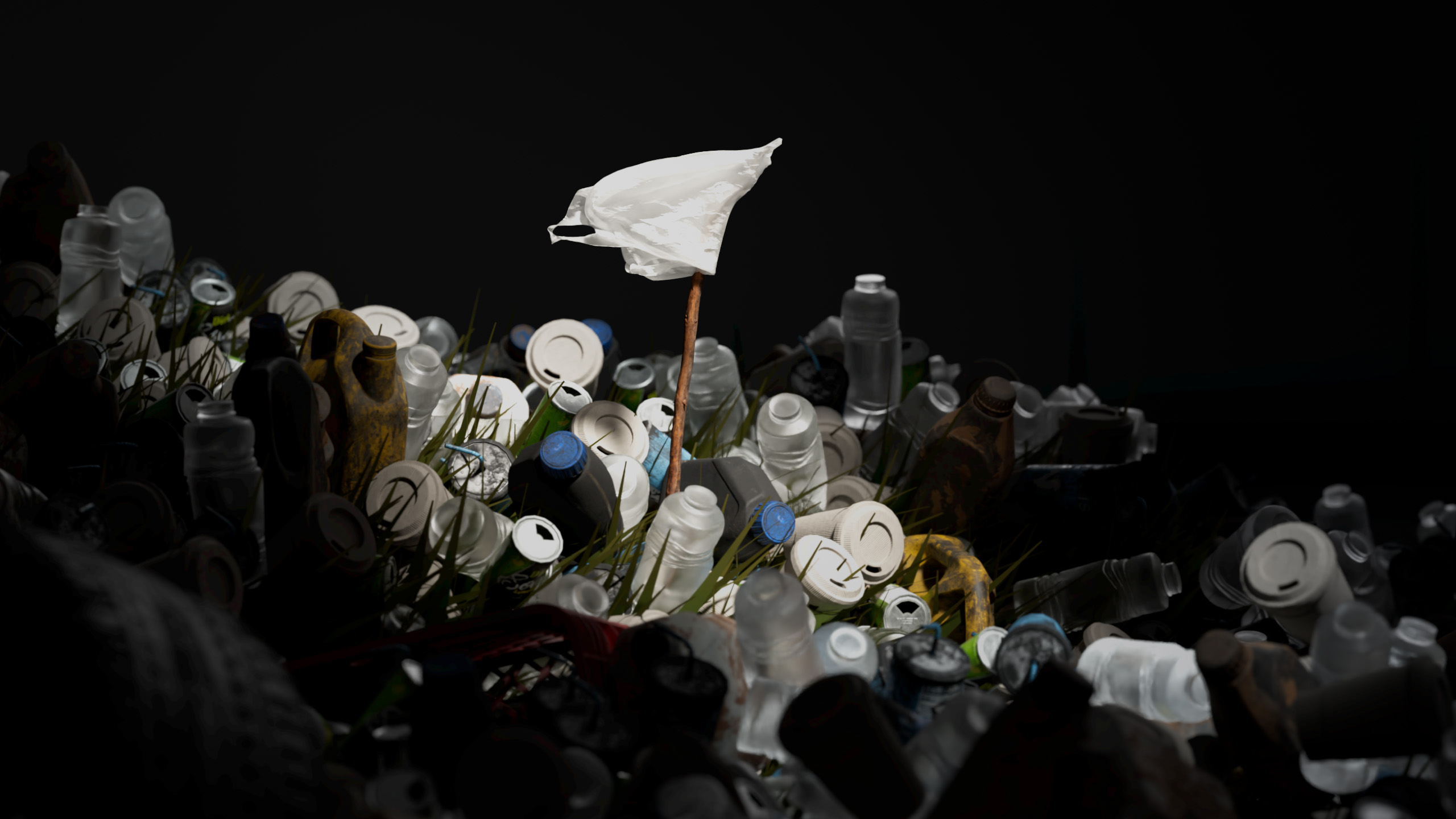
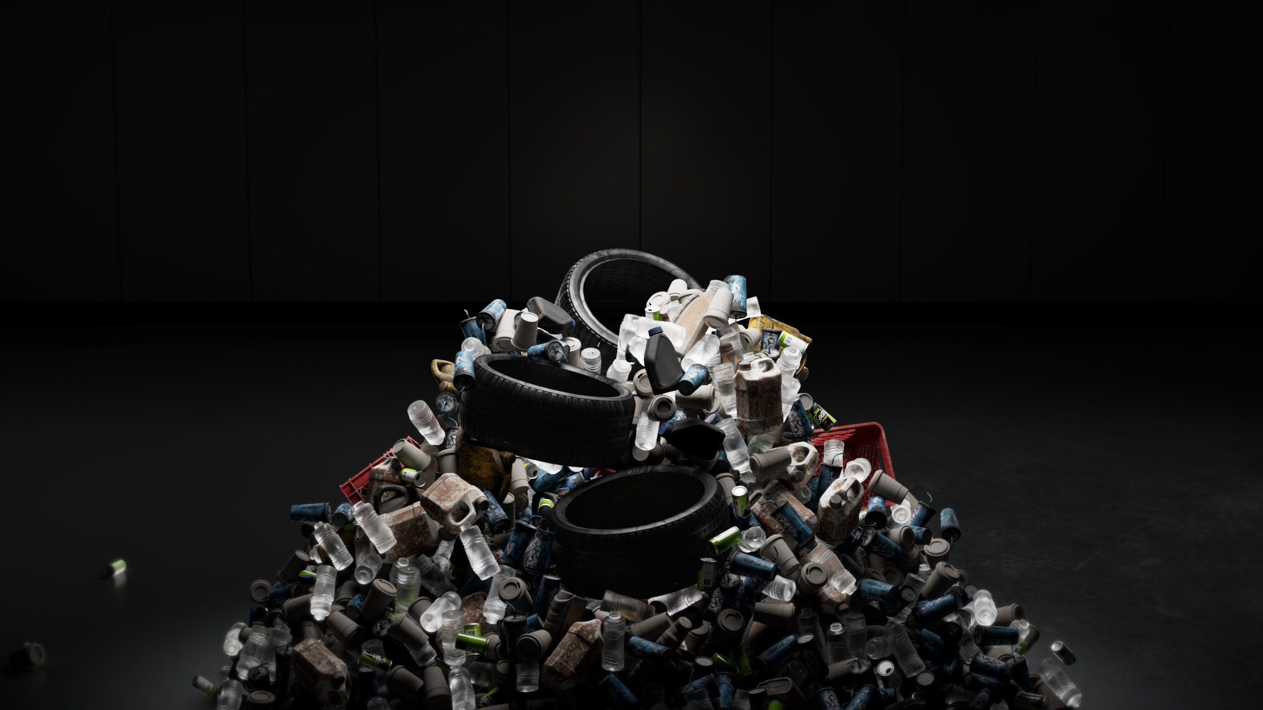
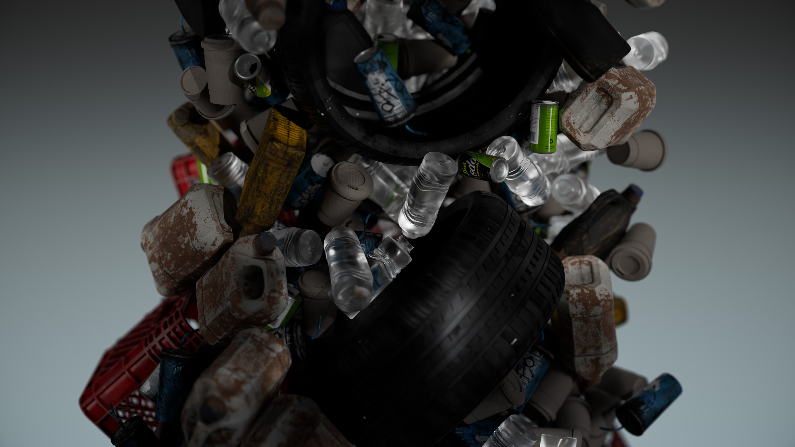
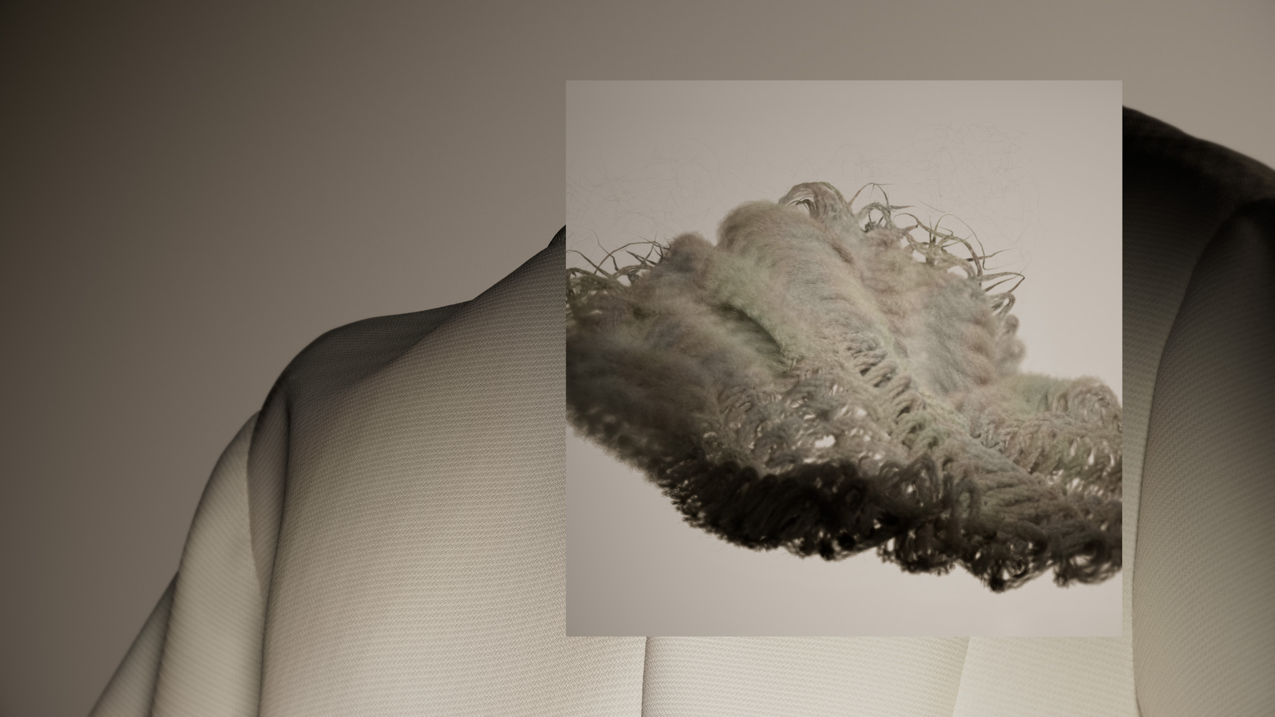
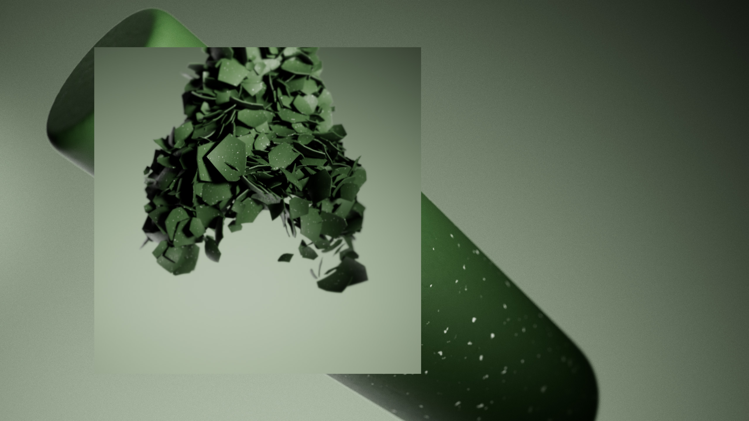
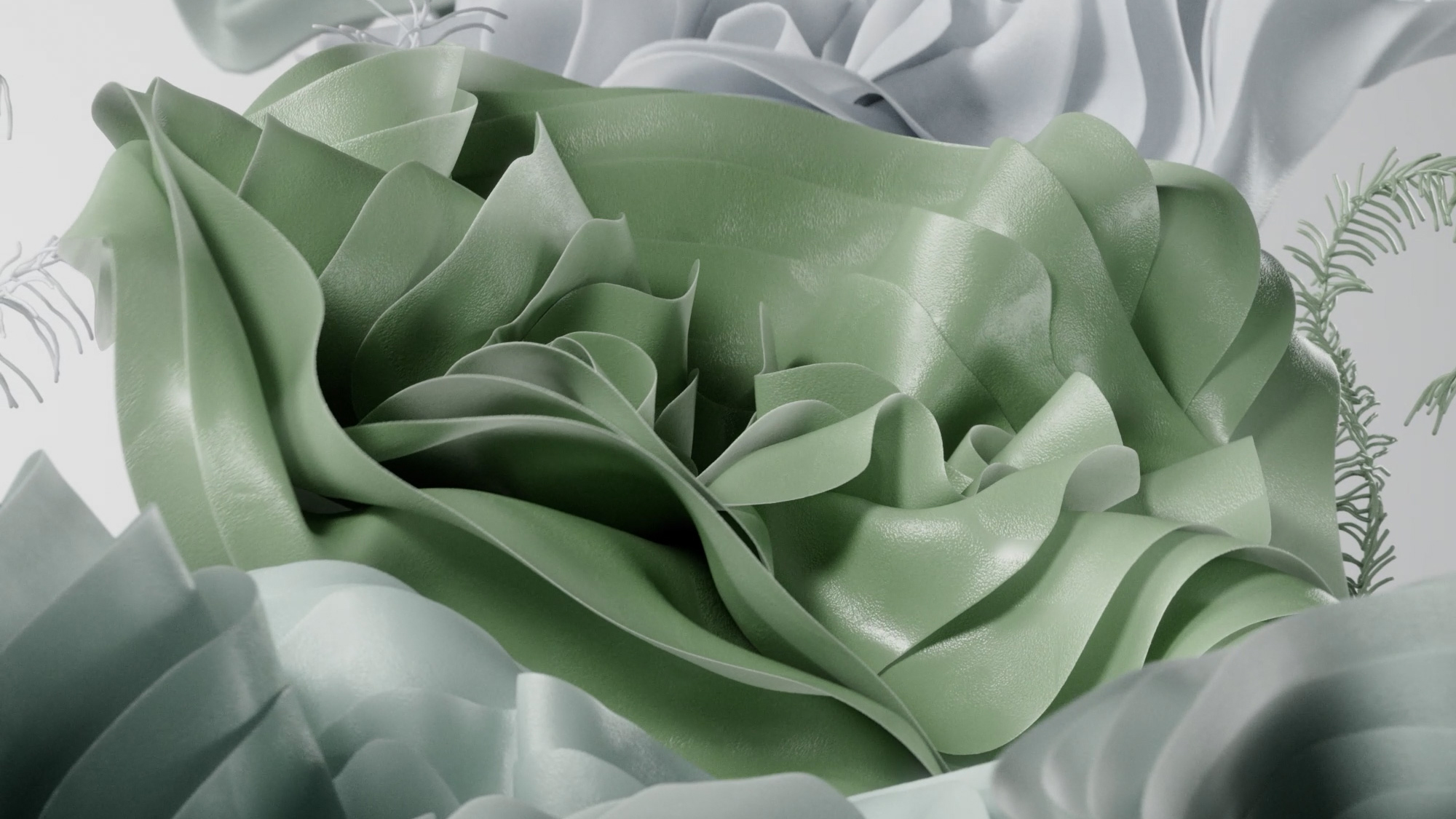
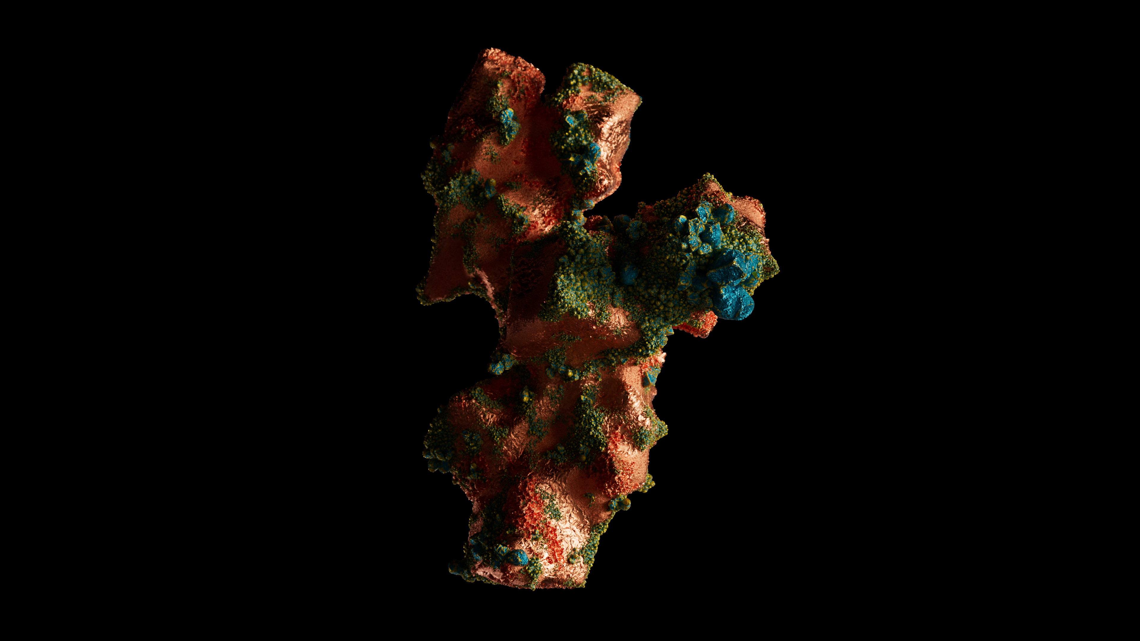
The most challenging aspect of the animation was depicting the lasting impact of synthetic plastic. To illustrate this, I contrasted it with growing grass driven by the Vellum simulation. Additionally, to convey the abundance of plastics that we have everywhere, I utilized the RBD system.
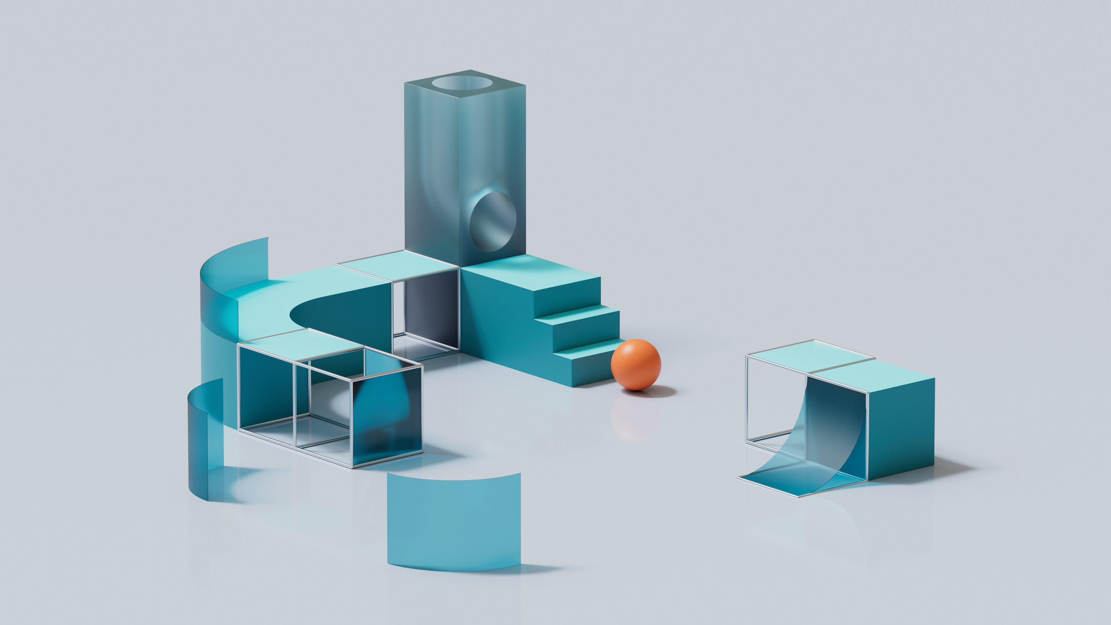
After several weeks of RND and understanding the possibilities, I consolidated the visual direction for the project and underwent the look of the piece.
Given the urgency of the issue, Good Form sought a bold and dynamic piece. However, I introduced a touch of poetic and slow-paced elements at the beginning to ease the audience in.
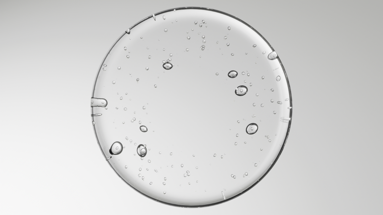
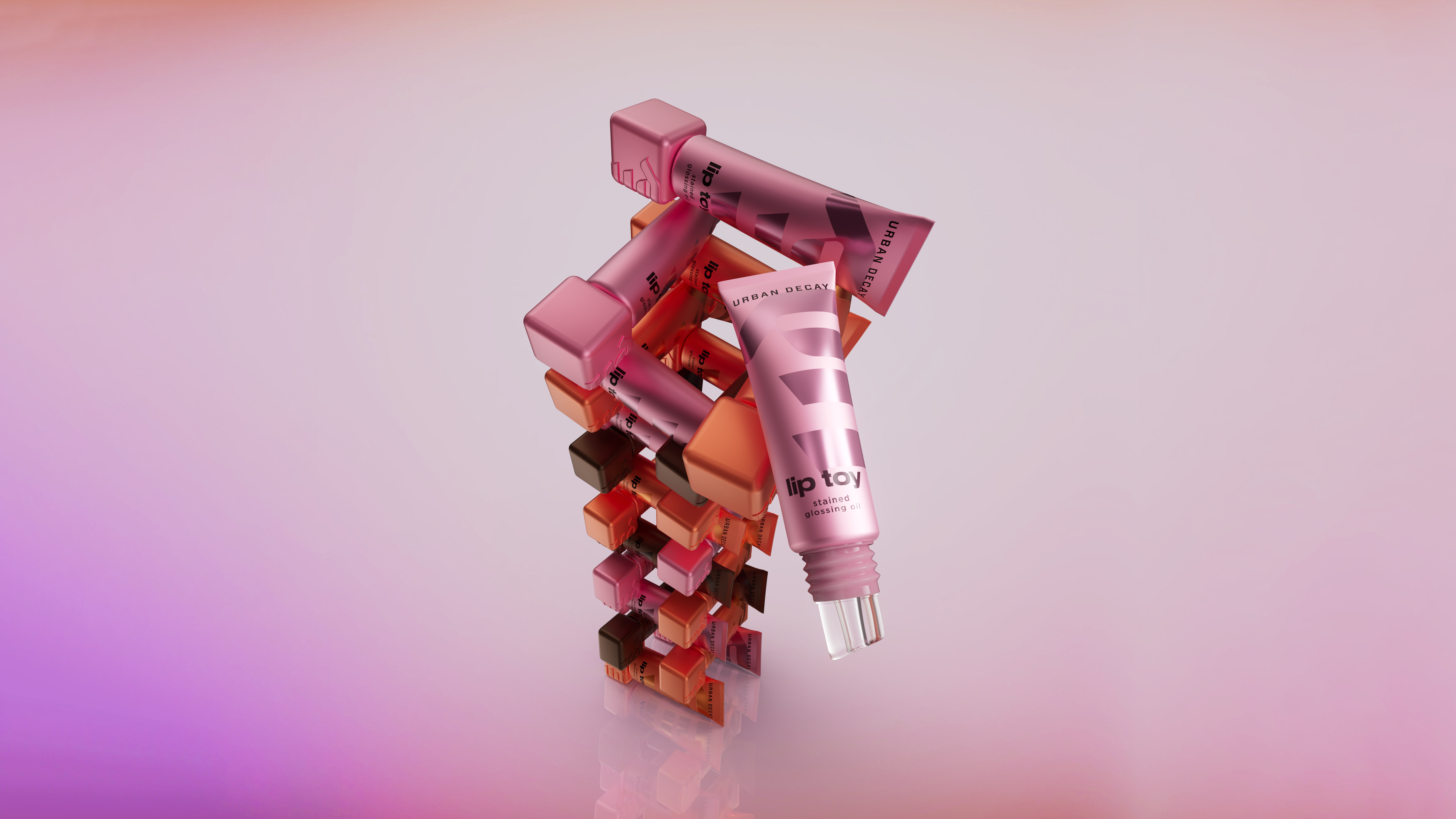
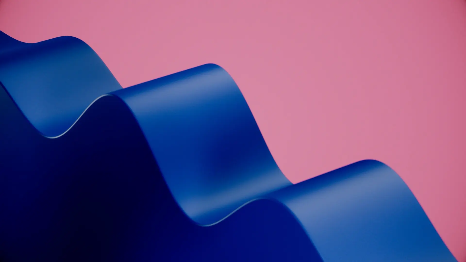
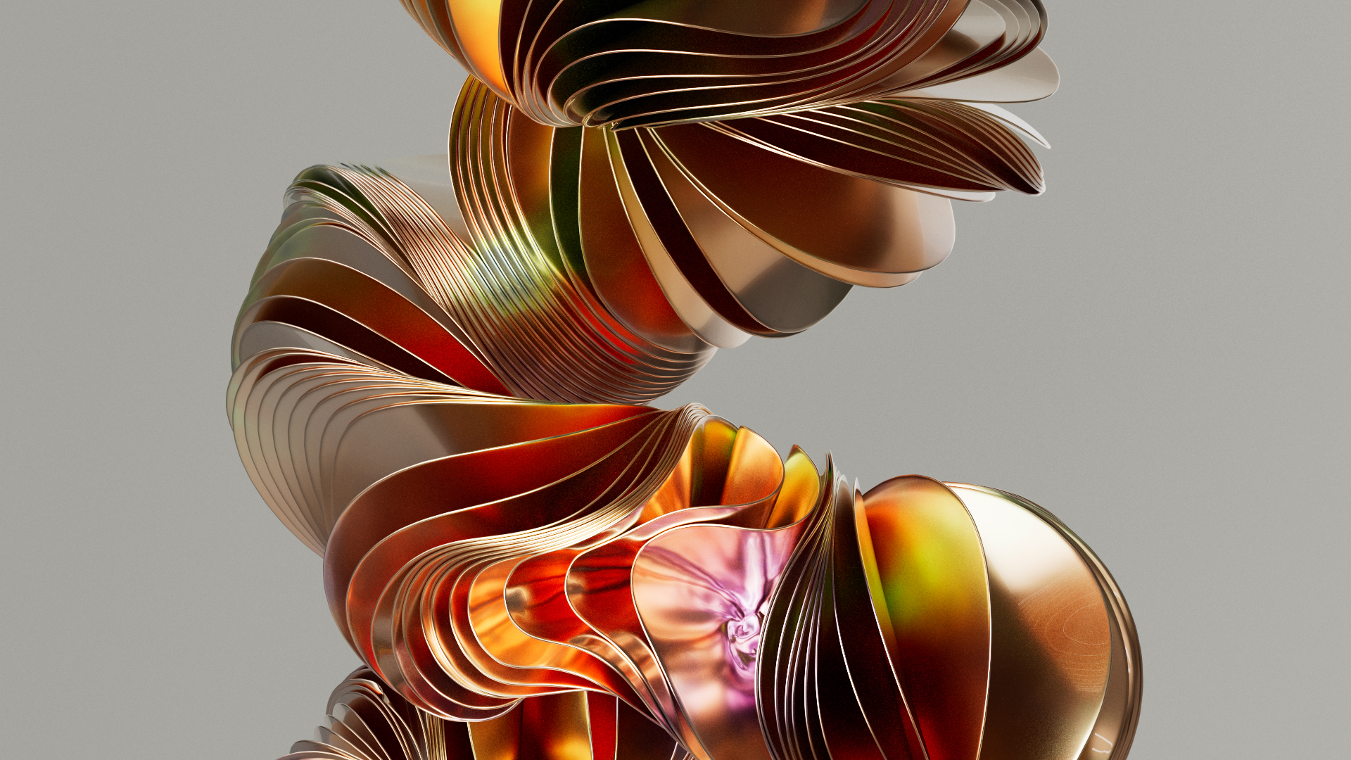
The scenes depicting the negative impact of plastics were characterized by cold and gray tones, while the recycled portions exuded warmth and cheerfulness to show positivity.
To futher enhance the look and unify the design of the whole piece, I did some color correction in post-production.
